Friday, October 29, 2010

Star Plot


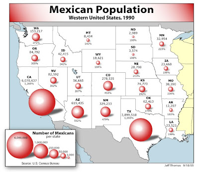
 A star plot allows you to show the value of different variables and then compare their relationship. This star plot shows the  different design possibilities of robots for NASA. As we see in the star plot, all the robots were very strong in some areas but performed low in others.


http://start1.jpl.nasa.gov/caseStudies/autoTool.cfm

Similarity Matrix


A similarity matrix shows the similarity between different variables. This similarity matrix shows the relationship of longevity genes and diet, gender, etc. in mice.


http://www.biomedcentral.com/1471-2164/8/353/figure/F5?highres=y

Box Plot


A box plot is a suitable way of depicting certain groups of numerical data into a five number summary. This is a box plot of the annual snow depth at Mathsville Ski resort.

http://edubuzz.org/blogs/nbhs3x1/2007/01/08/8-jan-2007-five-figure-summary-and-box-plots/

Triangular Plot


A Triangular plot is usually a graph of 3 variables, which is sometimes used in  geologic studies to show the comparative compositions of like rocks and soils.  They also can be used and applied to any kind of system using three variables. This is a diagram of the Hmax off Kauai for various slip allocations between three Aleutian Sources.


http://www.pmel.noaa.gov/maillists/tmap/ferret_users/fu_2007/msg00384.html

Wednesday, October 27, 2010

Bilateral Graph


A bilateral graph is usually a graph that  displays two variables.It often shows an increase on one side of a zero line and a decrease on the other. On this bilateral graph it’s showing the trade balance of different countries and its deficit change.

http://mpettis.com/2009/08/yet-another-discussion-on-the-asian-savings-glut-hypothesis-and-why-it-matters

Nominal Area Choropleth Map


The Nominal area choropleth map is a map that displays nominal data. This choropleth map is a map of the United States, and the distributions of the different religions around the nation, in different states. 


http://www.sixsteps.org/2006/04/

Unstandardized Choropleth Map


Unstandardized Choropleth maps are maps that demonstrate information without averaging the data, in no sort of way using raw numbers. This detailed map shows the population in Europe.

http://support.sas.com/documentation/cdl/en/graphref/63022/HTML/default/viewer.htm#overview-gmap.htm

Univariate Choropleth Map


A Univariate Choropleth map displays a one variable data set. This is showing the change of divorce rates in the United States from 1980 to 1990.

http://www.pop.psu.edu/gia-core/divorce.htm

Isobars

An Isobar is a connecting line that joins equals atmospheric pressure. This is an isobar map of Europe.

http://www.leafline.net/pages/weather/information/pressure.htm

LIDAR


The LIDAR is a remote sensing system that measures certain properties of spreaded light to search for information of a isolated target. 


http://www.loc.gov/exhibits/911/911-maps.html

Cartogram

A Cartogram is a map that shows a certain variable substituted for geographical size or area on a map. 

http://www.ncgia.ucsb.edu/projects/Cartogram_Central/

Continuously Variable Proportional Circle Map


A Continuously Variable Proportional Circle Map is a map that utilizes a proportional circle to create point data.The circles show data measurements continuously and can be any size in proportion to the data being measured.  This is a Continuously Variable Proportional Circle map of the Mexican population in particular states in the Western United States in 1990

http://www.neiu.edu/~ejhowens/377/examples.htm
Click on "Mexican population with spheres/volumes"

Range Graded Proportional Circle Map


A range graded proportional circle map is a circle map that represents the circles in proportion to ranges of data. This is a proportional circle map of the internet users in 2004 in Europe.

http://www.geog.ucsb.edu/~jeff/gis/proportional_symbols.html

Monday, October 11, 2010

DOQQ


A DOQQ is a digital uniform level image formed from aerial like photos. This is an aerial image of the Mission Bay, Texas.


http://www.tceq.state.tx.us/gis/doqsample.html

Wednesday, October 6, 2010

DLG


The DLG, which stands for Digital Line graph, is a digital vector data map that symbolizes cartographic information, which can contain a variety of information like roads, and boundaries. DLG maps are created using map from the USGS.

  http://web.wt.net/daba/dlg/default.html

DRG


The DRG, which means Digital Raster Graphics, that are scanned images of the U.S Geological Survey topographic maps. 


http://www.tceq.state.tx.us/gis/drg.html

Standadized Choropleth Maps


The standardized Choropleth map is a map that shows the different distributions of data within a particular area. This is a standardized choropleth map of the Per Pupil Expenditure for Public Education in North Carolina.  

http://mapmaker.rutgers.edu/356/links.html


Lorenz Curve


The Lorenz Curve is a graph that represents the distribution of a variable as well as an independent variable.  It also includes the cumulative percentage of the values. 


http://www.people.hofstra.edu/geotrans/eng/ch4en/meth4en/gini.html

DEM


The DEM, which stands for Digital elevation model is a representation of a ground surface topography, and is digital. This digital elevation model is a model of Eritrea, Africa


http://www.satimagingcorp.com/svc/dem.html

Flow Map


The flow map is a map that shows objects or people moving from one location to another. For example, it might show the amount of people in a migration or the number of goods being exchanged. This map shows truck flow across the United States.

http://ops.fhwa.dot.gov/freight/freight_analysis/faf/faf2_reports/reports7/c5_assign.htm

Isotachs


An Isotach map is a map that shows lines in a given surface that connects points with equal wind speed.This is a isotach of Eastern United States.


http://cimss.ssec.wisc.edu/goes/blog/archives/5353

Isopach


An isopach map is a map of areal extent and depth of a stratigrapic unit. It is also used in geological exploration for structural analysis and oil. This is an isopach map of Holocene Overburden. 

http://seeps.geol.ucsb.edu/pages/isopach.html

Isopleth Map


An isopleth map is a map that shows data value by means of lines joining points of equal value. This is a isopleth map of Spain.


http://geographyfieldwork.com/DataPresentationMappingTechniques.htm

Black and White Aerial Photo

A Black and White Aerial Photo is a black and white photo which is much like a satellite view but taken by an airplane. This is a black and white aerial photo of downtown Kansas City in Missouri.

http://isaacalongi.com/kansas-city-aerial-photography/

Wednesday, September 29, 2010

Proportional Circle Map

A Proportional circle map is a map that presents data relative to the size of circles. This is a proportional circle map of the Urban population. 
 http://mapmaker.rutgers.edu/355/links.html
Must click on "Urban Population"

Propaganda Map


A Propaganda map is used to make people see things differently and think differently. It is used to persuade people and can be very powerful.  This is a French map to convince people to fight the German in WWI.


http://www.alternatehistory.com/discussion/showthread.php?t=76102

PLSS Map


The PLSS map is mostly used in the U.S, to divide land parcels, mainly for titles and deeds of rural land, and also undeveloped land.


http://www.rootsweb.ancestry.com/~alfrankl/landrecords.htm

Cadastral Map


The cadastral map is a widespread register of the metes and bounds real property of a country.


http://www.icsm.gov.au/mapping/maps_cadastral.html

Tuesday, September 28, 2010

Parallel Coordinates


The Parallel Coordinates graph is a graph used to visualize high dimensional geometry and to evaluate multivariate data. 


http://eagereyes.org/techniques/parallel-coordinates

Dot Distribution Maps


The dot Distribution map is a map full of dots, which are symbols to show the existence of a feature. This distribution map is a map of New Jersey of people and farms


http://www.flatrock.org.nz/topics/new_jersey/where_do_they_live_and_what_do_they_do.htm

Hypsometric Maps


The hypsometric map is a map that is applied elevations by contours, and sometimes involve batching, and shade. This is hypsometric map of the Town of Dummerston, Vermont


http://mappery.com/Elevation-Map-of-Dummerston-Vermont

Monday, September 20, 2010

Stem and Leaf Plot


A steam and leaf plot diagram shows a summary of data. This steam and leaf plot diagram shows the high temperature in Oswego.


http://knol.google.com/k/overview-of-statistics#

Statistical Maps


A statistical map is a map that shows distinction in quantity of a factor including things like population, rainfall, or crops in a certain geographic area.This is a Statistical Map of the population of the largest cities in the world.


http://www.skyscrapercity.com/showthread.php?p=52580161

Infrared Aerial Photo


The infrared aerial photo is a photo used to display  positive changes to the environment, including certain kinds of wetlands and oceans. This is a infrared aerial image of Discovery Bay, a cul-de-sac community of recreational boat owners.


http://www.deltanationalpark.org/tag/water

Cartographic Animation

Cartographic animation are maps that add animation for a better view


http://www.geoinnovations.co.uk/html/Markets.html

Climograph


 A climograph is a graph that shows monthly precipitation and temperature conditions for a place. This is a Climograph of Quebec.


http://geography.ridley.on.ca/CGC1D/Students/Quebec2/Geo./Climographs.htm

Sunday, September 19, 2010

Correlation Matrix


A correlation matrix describes the relationship among a number of variables. This is a correlation matrix of analyzed enzymes and metabolites.


http://genomebiology.com/2008/9/8/R129/figure/F4?highres=y

Doppler Radar


Doppler radar is a radar that produce velocity data about objects at a distance. This is a doppler radar of tropical storm Alberto.


http://www.srh.noaa.gov/tae/?n=event-200606_alberto

Histogram


Histograms are used to estimate the probability distribution of variables. In this histogram it shows the number of students and their score on the final exam.


http://searchsoftwarequality.techtarget.com/sDefinition/0,,sid92_gci330729,00.html

Population Profile


A population profile is a chart showing the number of people as a function of their ages. My population profile shows the difference between the size of the actual population and what the population would be if they did not have AIDS.


http://www.ifad.org/operations/regional/pf/aids_1.htm

Isohyet Map


Isohyets is a map that shows lines connecting points having the same amount of rainfall in a given period. This is a isohyet map of New Zealand.


http://www.scoop.co.nz/stories/AK0808/S00090.htm

Wednesday, September 15, 2010

Unclassed Choropleth Map


An Unclassed Choropleth Map are maps that specifically show the assign shadings comparative to the data standards, in which that the choropleth map doesn’t have to organize the data.


http://www.menacorde.com/wordpress/?p=428

Tuesday, September 14, 2010

Choropleth maps


Choropleth maps are thematic maps in which the areas are shaded and/or patterned in a certain proportion to measurements. This choropleth map shows the percentage of the persons who are Hispanic or Latino in the state of Florida.


http://my.ilstu.edu/~jrcarter/Geo204/Choro/Tom/

Bivariate Choropleth Map


A bivariate choropleth map shows two variables on a map by joining two different sets of symbols or colors. This bivariate choropleth map shows housing values and population for counties in Ohio.


http://proceedings.esri.com/library/userconf/proc99/proceed/papers/pap171/p171.htm

Monday, September 13, 2010

Classed Choropleth Map

A classed choropleth map is a type of choropleth map. They use colors or shading to show different values of data and groups those values.


http://www.neighbourhood.statistics.gov.uk/dissemination/Info.do?page=userguide/detailedguidance/statisticalpresentation/statisticalmaps/best-practice-statistical-maps.htm

Index Value Plot

An index value plot is a visual tool that displays plots values of data and then it connects those values. This is an index value plot that shows stock market prices in Australia.


http://www.justdata.com.au/Journals/Articles/trin.htm

Windrose


A windrose is a graphic tool used to view wind speed and direction for a particular location. This windrose shows wind speeds around Cumbria Soaring Club Sites which are located in the United Kingdom.


http://www.cumbriasoaringclub.co.uk/SiteManagement/CSC_WindRose.php

Scatterplot


A scatterplot is a type of mathematical diagram that shows the values of two variables for a set of data. This is a scatterplot of years of experience compared to income.


http://allpsych.com/researchmethods/correlation.html

Isoline Maps


Isoline maps are maps with continuous lines joining points of the same values. This is an Isoline map of the United States showing forecast winds.


http://www.kidsgeo.com/geography-for-kids/0034-isolines.php

Friday, September 10, 2010

Topographic Map


Topographic maps are maps that show lots of details of vertical features, like mountains,valleys, or hills. This is a topographic map of Waterford, Virginia.


http://www.waterfordhistory.org/map-waterford-topographic.htm